Bertrand MICHEL - Introduction to Topological Data Analysis
Practical lessons with Gudhi Python
We will follow the tutorial python notebooks of Gudhi.
Part 1: Data, Filtrations and Persistence Diagrams
Read the first two paragraphs (with the corresponding notebooks) of the tutorial main page.
Simplex trees and simpicial complexes
Persistent homology and persistence diagrams
Exercices
Exercise 1.
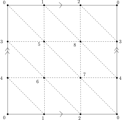
Recall the torus is the surface which is homeomorphic to the surface obtained by identifying the opposite sides of a square as illustrated on the Figure below.
 |
Using Gudhi, construct a triangulation ( -dimensional simplicial complex) of the Torus. You can visualize the torus with the code proposed in this notebook.
Define a filtration on it, compute its persistence and use it to deduce the Betti numbers of the torus (check that you get the correct result using the function betti_numbers().
-dimensional simplicial complex) of the Torus. You can visualize the torus with the code proposed in this notebook.
Define a filtration on it, compute its persistence and use it to deduce the Betti numbers of the torus (check that you get the correct result using the function betti_numbers().
Exercise 2.
The goal of this exercise is to illustrate the persistence stability theorem for functions on a very simple example.
The code below allows to define a simplicial complex (the so-called  -complex) triangulating a set of random points in the unit square in the plane.
n_pts = 1000
#Build a random set of points in the unit square
X = np.random.rand(n_pts,2)
#Compute the alpha-complex filtration
alpha_complex = gd.AlphaComplex(points=X)
st_alpha = alpha_complex.create_simplex_tree(max_alpha_square=1000.0)
Let  and
and  be two points in the plane and let
  .
.
a) Build on such a simplicial complex the sublevel set filtration of the function

and compute its persistence diagrams in dimension  and
and  .
.
b) Compute the persistence diagrams of random perturbations of  and compute the Bottleneck distance between these persistence diagrams and the perturbated ones. Verify that the persistence stability theorem for functions is satisfied.
Exercise 3. Sensor Data
Download the data_acc.dat dataset at this adress address. Then load it using the pickle module:
import numpy as np
import pickle as pickle
import gudhi as gd
from mpl_toolkits.mplot3d import Axes3D

f = open("data_acc.dat","rb")
data = pickle.load(f,encoding="latin1")
f.close()

data_A = data[0]
data_B = data[1]
data_C = data[2]
label = data[3]
The walk of 3 persons A, B and C, has been recorded using the accelerometer sensor of a smartphone in their pocket, giving rise to 3 multivariate time series in  : each time series represents the 3 coordinates of the acceleration of the corresponding person in a coordinate system attached to the sensor (take care that as, the smartphone was carried in a possibly different position for each person, these time series cannot be compared coordinates by coordinates).
Using a sliding window, each serie have been splitted in a list of 100 times series made of 200 consecutive points, that are now stored in data_A, data_B and data_C.
: each time series represents the 3 coordinates of the acceleration of the corresponding person in a coordinate system attached to the sensor (take care that as, the smartphone was carried in a possibly different position for each person, these time series cannot be compared coordinates by coordinates).
Using a sliding window, each serie have been splitted in a list of 100 times series made of 200 consecutive points, that are now stored in data_A, data_B and data_C.
1. Plot a few of the time series to get an idea of the corresponding point clouds in . For example:
data_A_sample = data_A[0]
plt.gca(projection='3d')
plt.plot(data_A_sample [:,0],data_A_sample [:,1],data_A_sample [:,2] )
2. Compute and plot the persistence diagrams of the Vietoris-Rips and the alpha-complex filtrations, for a few examples of the time series.
3. Compute the -dimensional and -dimensional persistence diagrams (-shape or Rips-Vietoris filtration) of all the time series. Compute the matrix of pairwise distances between the diagrams (as this is may take a while, you can just select a subset of all the diagrams where each of the 3 classes A, B and C are represented). Visualize the pairwise distances via Multidimensional Scaling (use a different color for each class). You can use sklearn for that:
from sklearn import manifold

# B is the pairwise distance matrix between 0 or 1-dim dgms
#label_color contains the colors corresponding to the class of each dgm
mds = manifold.MDS(n_components=3, max_iter=3000, eps=1e-9,
                   dissimilarity="precomputed", n_jobs=1)
pos1 = mds.fit(B1).embedding_
fig = plt.figure()
ax = fig.add_subplot(111, projection='3d')
ax.scatter(pos1[:,0], pos1[:, 1], pos1[:,2], marker = 'o', color=label_color)
4. Use the function below to embed the data in dimension  with a delay equal to (time-delay embedding) and do the same experiments as previously, using the Vietoris-Rips filtration this time.
def sliding_window_data(x,edim,delay=1):
    """time delay embedding of a d-dim times series into R^{d*edim}
    the time series is assumed to be periodic
    parameters:
        + x: a list of d lists of same length L or a dxL numpy array
        + edim: the number of points taken to build the embedding in
          R^{d*edim}
        + delay: embeeding given by (x[i],x[i+delay],...,
          x[i + (edim-1)*delay])
          Default value for delay is 1
    """
    ts = np.asarray(x)
    if len(np.shape(ts)) == 1:
        ts = np.reshape(ts,(1,ts.shape[0]))
    ts_d = ts.shape[0]
    ts_length = ts.shape[1]
    #output = zeros((edim*ts_d,nb_pt))
    output = ts
    for i in range(edim-1):
        output = np.concatenate((output,np.roll(ts,-(i+1)*delay,axis=1)),axis=0)
    return output
Part 2: TDA and Statistics
For many applications of persistent homology, we observe topological features close to the diagonal. Since they correspond to topological structures that die very soon after they appear in the filtration, these points are generally considered as “topological noise”. Confidence regions for persistence diagram provide a rigorous framework to this idea. This notebook introduces the subsampling approach of Fasy et al. 2014 AoS.
Part 3: Representations of TDA and Machine Learning
In this notebook, we learn how to use alternative representations of persistence with the representations module and finally we see a first example of how to efficiently combine machine learning and topological data analysis.
This notebook illustrates Perslay: a neural network layer for persistence diagrams and new graph topological signatures.
Exercise 4. Sensor Data By computing representations of persistence to train a classifier on the Sensor Data of Exercice 3.
Part 4: Mapper with Gudhi
This notebook illustrates the use of Mapper. If you want to run it, you have to install the Mapper branch of the Gudhi library! (soon merged in Gudhi).
Alternatively, you can try Mapper with R.